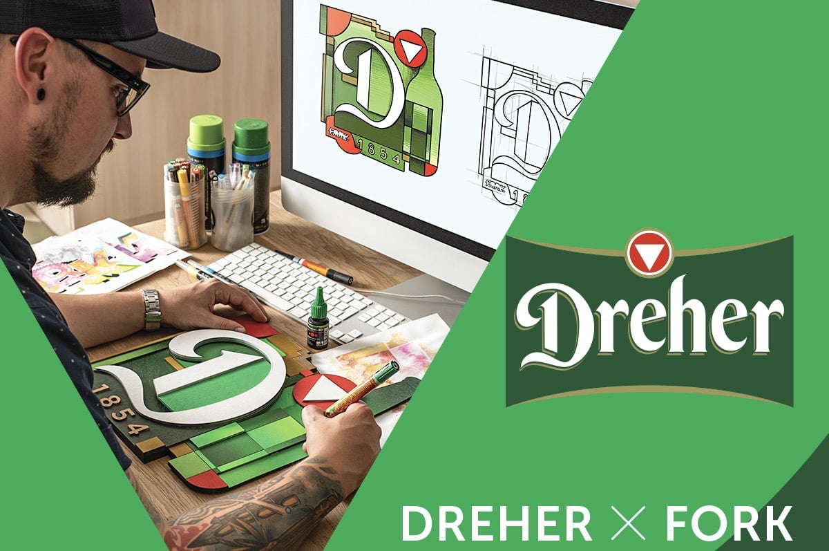
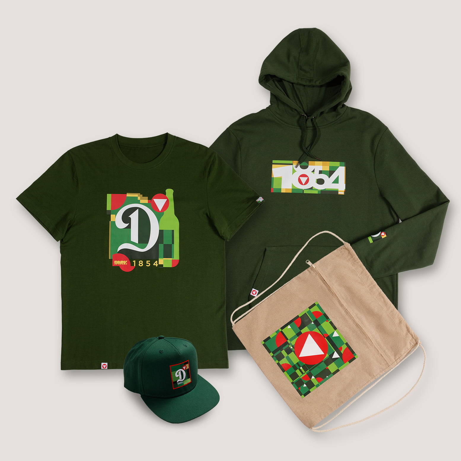
The well-known urban designer and graphic artist, Imre Fork designed a capsule collection for the historic brewery. According to himself, he wanted to create something that Dreher fans and his followers would be happy to wear. Unique streetwear pieces include t-shirts, sweaters and hats.
Attention! For over 18s only! www.alkohol.info.hu
Is this your first clothing collection or have you had similar work before?
I started my career with a printing internship, which gave me the right foundation to then learn the necessary additional techniques at a clothing company and utilize this together. Later, I made uniforms for several Hungarian and foreign companies, then merch products for bands and athletes, sports associations, and a few years ago I crowned this line with a 2-season T-shirt collection thanks to Tisza shoes.
How was working together?
It was really great to work with HTX, they helped me in everything and I was given complete freedom from the first rounds. They wanted me to be involved in the designs and to go beyond the usual domestic collaborations, and the result should not be just an applied graphic based on an image manual.
We also got great feedback from Dreher, and together we finalized the final shape of the collection with the entire staff. It was a special pleasure to be able to work with Tatlin and his super team again after a few years.
What was the challenge?
In the first round, I wanted to create a series of very colorful and form-breaking graphics with a digital effect characteristic of me, but I realized that it wouldn't be real if I followed my own mind. The entire staff trusted me and accepted my plans, but I was still not satisfied. I wanted to create something that both Dreher fans and my followers would love to wear, that properly represents the traditions and heritage of the brand and at the same time shows my style.
How did you get inspired?
At the very beginning of the process, I started sketching based on the renewed image, mixing in the digital world characteristic of me. I created several concepts, of which the winner was a mix of directions called "Urban Jungle" and "Budapest Montage". Then I chose the D from the Dreher logo, the triangle icon, 1854 and the silhouette of the iconic Dreher glass as the main symbols, I started from these as the basis of form.
My graffiti past gave me one of the main inspirations, where I always played with letters and shapes, so I started breaking down letters into shapes and building from them. In terms of colors, I tried to use the green glass, red icon and white logo characteristic of Dreher as a basis and by mixing these colors to create a more restrained but characteristic harmony than my own style.
At the same time, I also tried to display the past of Dreher, and for this I looked for iconic artists from the past who used bold and new techniques that made them worthy of legendary creators. Walking in Budapest, looking at buildings, I looked for that characteristic legacy from the past, which now creates a noble but modern effect in my design, filtered through me.
Focusing on the beautiful buildings visible in the city, I noticed the detailed glass and mosaic works on closer inspection. The solutions of Miksa Róth and Victor Vasarely came to my mind, the breakdown into color and form provided the basic idea. My pixelated, digital world is a perfect counterpart to the mosaic and stained glass technologies used in the past, so the direction that can connect Dreher's past and my present has come together.
Anything you can think of about the collaboration and interesting/funny/exciting info?
– I created 4 concepts with several types of products (there were also winter/summer accessories) after the first round of briefs, based on these we arrived at the final graphics and products.
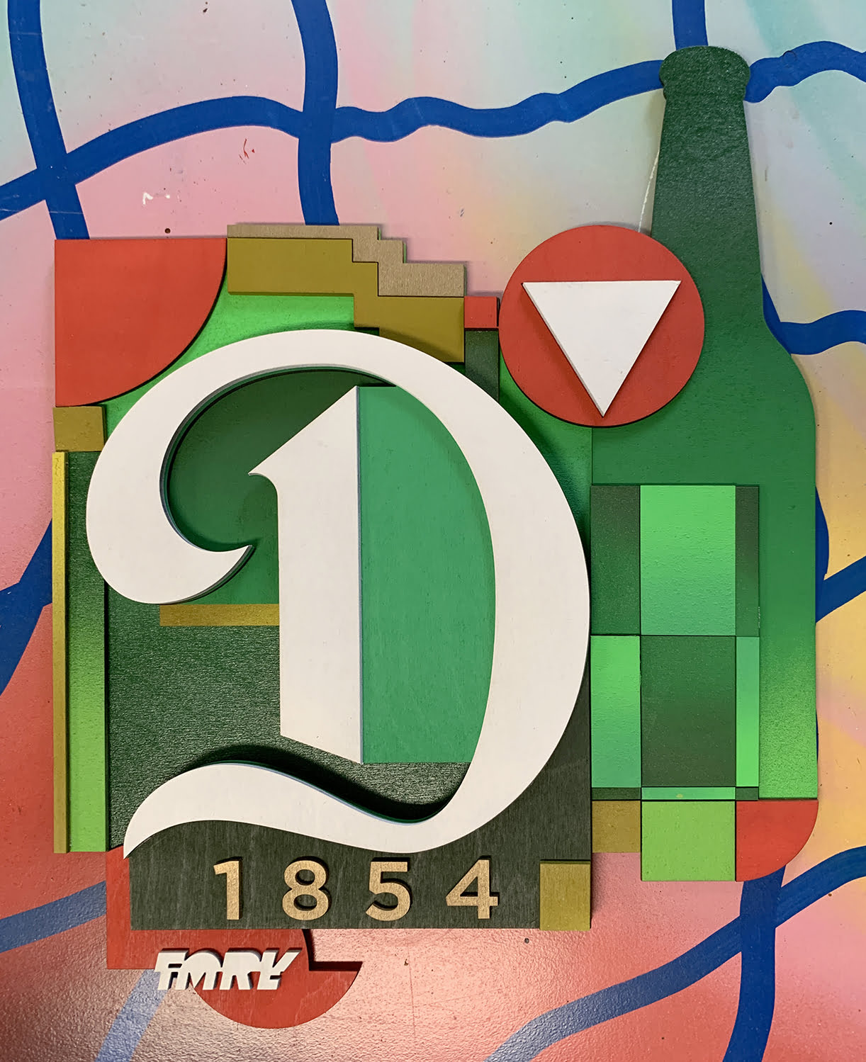
– For the teaser phase, I made a wooden ornament based on the final design (this "sculpture" took 3 days in my studio at KREATIV WERK)
- Tatlin and Barnie were immediately on the same wavelength, it was clear that a patina industrial background was needed for the photography to offset the modern style of the collection
– The photographed models are young street dancers who perfectly brought the vibe we wanted: the world of today's young people in Budapest
– The day after the printing materials were delivered, there was a pipe break in our apartment, where my computer was also damaged, but luckily the production process had already started, so I didn't have to plan everything again
The Dreher X Fork Imre limited collection can only be purchased online, Dreher in your webshop.